Brand Kit
The VisitingMD identity, in one place.
A quiet, editorial system built for a physician-led house-call practice. Warm, dignified, and unhurried — like the medicine itself.
01 — Mark
Logo

Anatomy
- Visiting — Fraunces medium, 500 weight, tight tracking (-1.5%).
- MD — Same face, set in Deep Teal (primary).
- The dot — A single Clay dot, 25% of the cap height, offset to the right of the baseline. It is a marker — a pin, a pulse.
Clear space & don'ts
- Minimum clear space equals the cap height of the "V" on all sides.
- Minimum digital size: 96px wide. Print: 0.75 inch wide.
- Do not recolor the wordmark. Do not condense, outline, or add drop shadows.
- Do not remove the Clay dot — it is part of the mark, not decoration.
02 — Palette
Color
Primary surface. The paper the practice is written on.
Brand primary. Buttons, links, physician-forward moments.
Warm human accent. The dot, eyebrows, small emphases only.
Body text and headlines. Never pure black.
Supporting tone. Backgrounds, quiet callouts, illustration.
Section fills, footers, subtle dividers.
Deep Teal and Warm Cream carry ~80% of any composition. Clay is a spice — never a base. Sage softens medical contexts; Ink Navy anchors editorial ones.
03 — Type
Typography
Display / Serif
Fraunces
Regular · Medium · Semibold
Unhurried, bedside medicine — delivered with dignity.
Used for all headlines, wordmark, and long-form editorial moments. Tracking -1.5%. Weight 400–500. Avoid 700+ except at very small sizes.
Body / Sans
Inter
Regular · Medium
We visit patients at home in Bucks, Montgomery, and Philadelphia counties. Every appointment is unhurried, physician-led, and rooted in continuity of care.
Body copy, UI, forms, navigation. 15–17px base. Line height 1.6+. Never all-caps except for micro eyebrows at 0.2em tracking.
Scale
04 — Voice
Tone of voice
We sound like
- Calm. Short sentences. Steady cadence. No exclamation points.
- Direct. We name things plainly — pain, dementia, grief, cost.
- Warm. Second person. We speak to a family, not a market.
- Physician-first. A doctor is speaking. Never a brand.
We don't sound like
- Startup-y. No "unlock," "revolutionize," "next-gen."
- Corporate-medical. No "solutions," "leverage," "care journey."
- Salesy. No urgency tactics, no exclamation-heavy CTAs.
- Clinical-only. Jargon is defined, or replaced.
Instead of
"Unlock next-generation care solutions for your loved one today!"
Write
"A doctor visits your home. We manage symptoms, medications, and the conversations that matter."
Instead of
"Book now — limited spots available!"
Write
"Call (267) 412-3165 to see if we're a fit."
05 — In situ
Apparel & merchandise
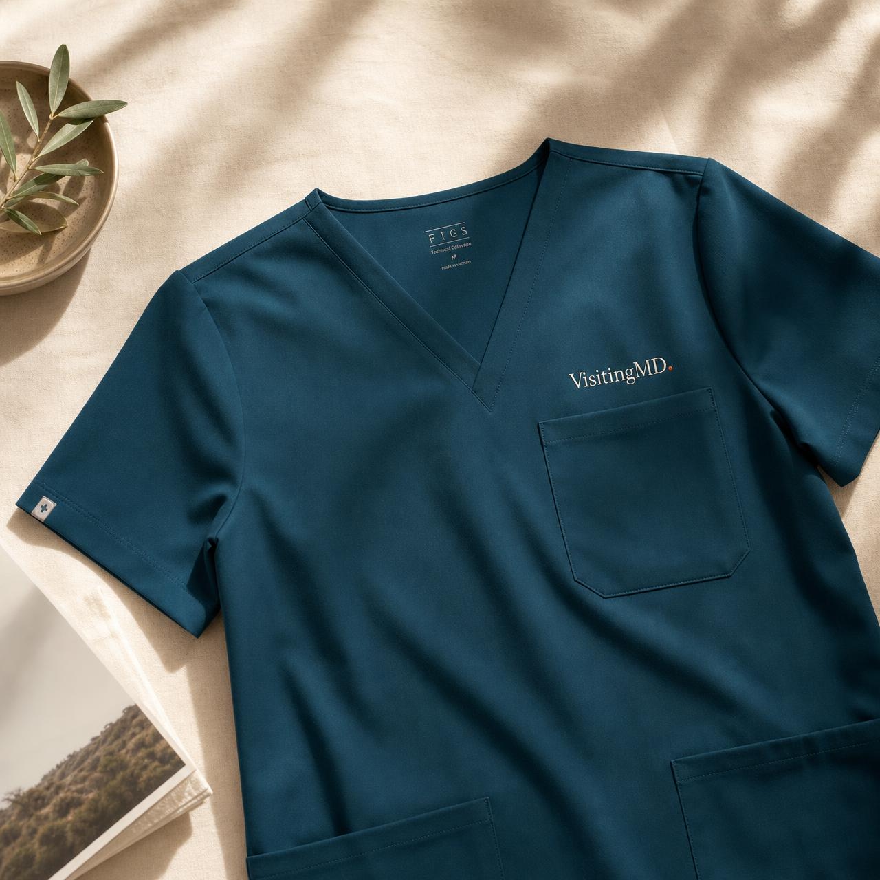
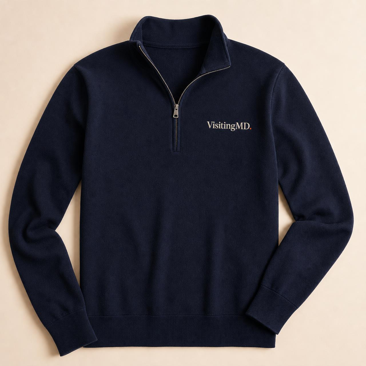
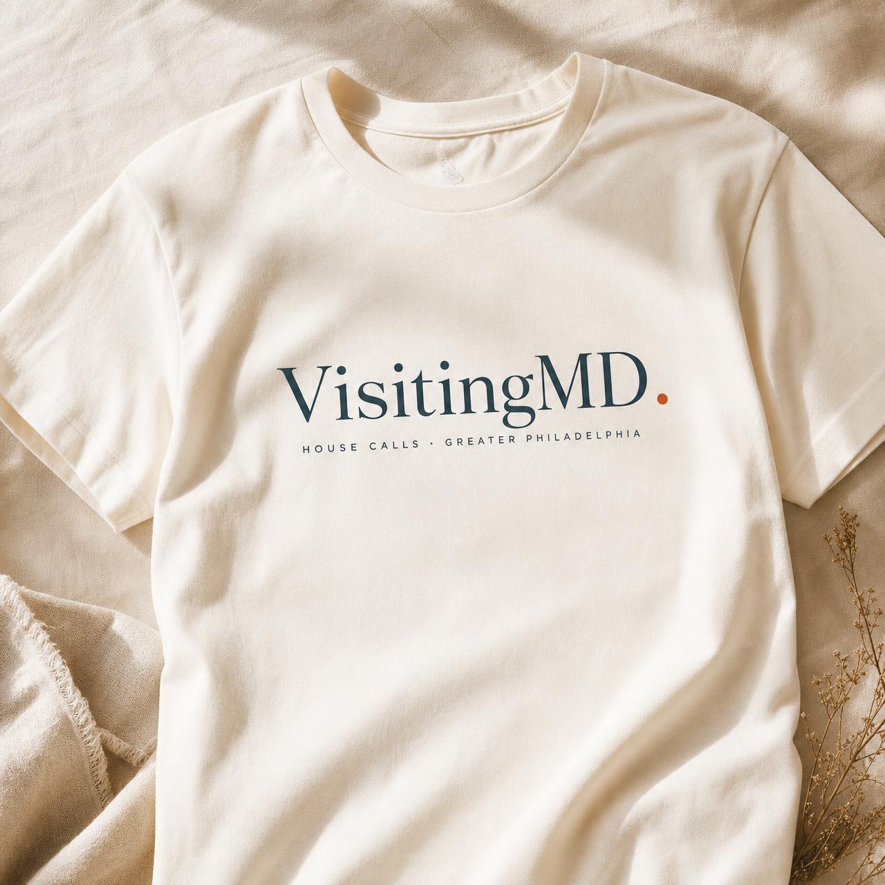
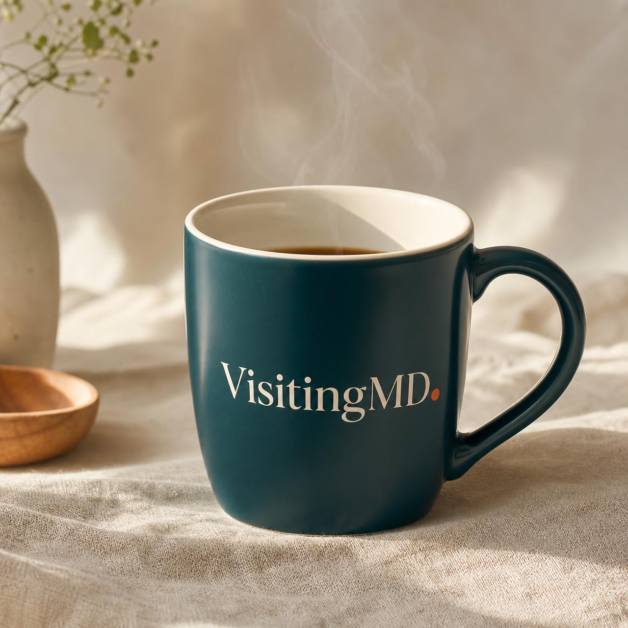
Merch is worn at the bedside, in hospital hallways, and in patients' homes. Restraint is the brief — one logo, one color, quiet embroidery over screen print wherever possible.
Scrubs
Deep Teal top and bottom. Cream embroidered wordmark, chest-left, 2.5" wide. Clay dot in embroidery, never printed.
Quarter-zips & T-shirts
Ink Navy quarter-zips for provider staff. Cream tees for outreach and gifts. Wordmark only — no taglines on clothing.
Mugs & stationery
Deep Teal ceramic, cream interior. Letterhead on uncoated cream stock, single-color teal printing, no gloss.